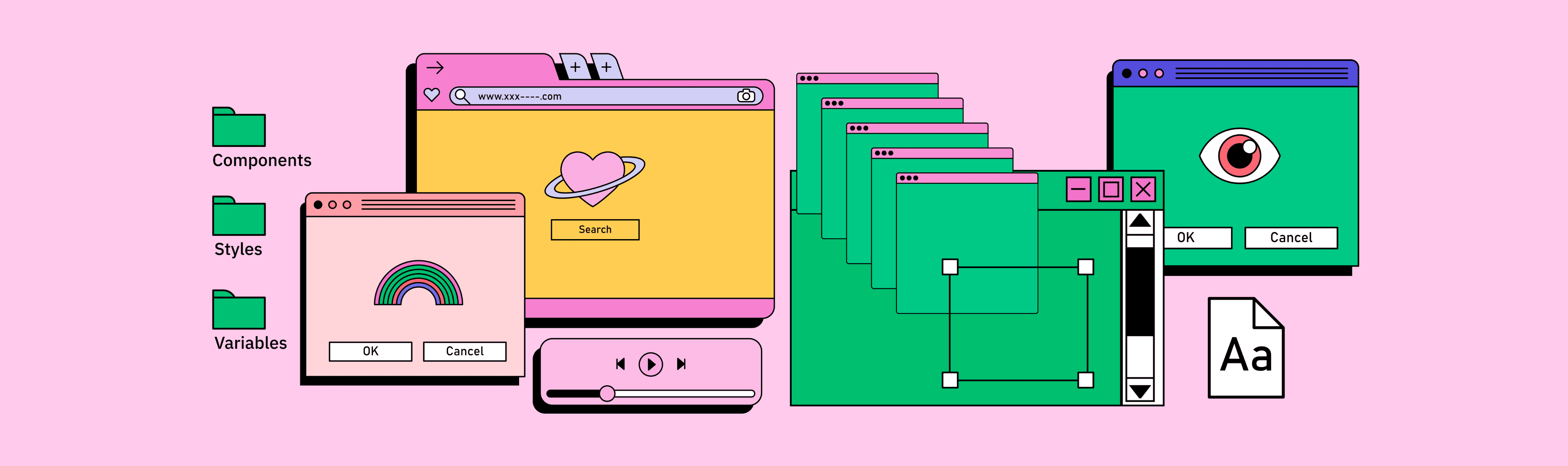
Philosophy
My experience building design systems from scratch at Pair Eyewear and integrating into existing systems at Freshly has instilled the importance of standardized, reusable, and scalable design components.
The ideal outcome is a system where designs can be clearly communicated using defined styles, variables, and semantics. This empowers the engineering team by enabling them to understand and implement features efficiently, right from the start.
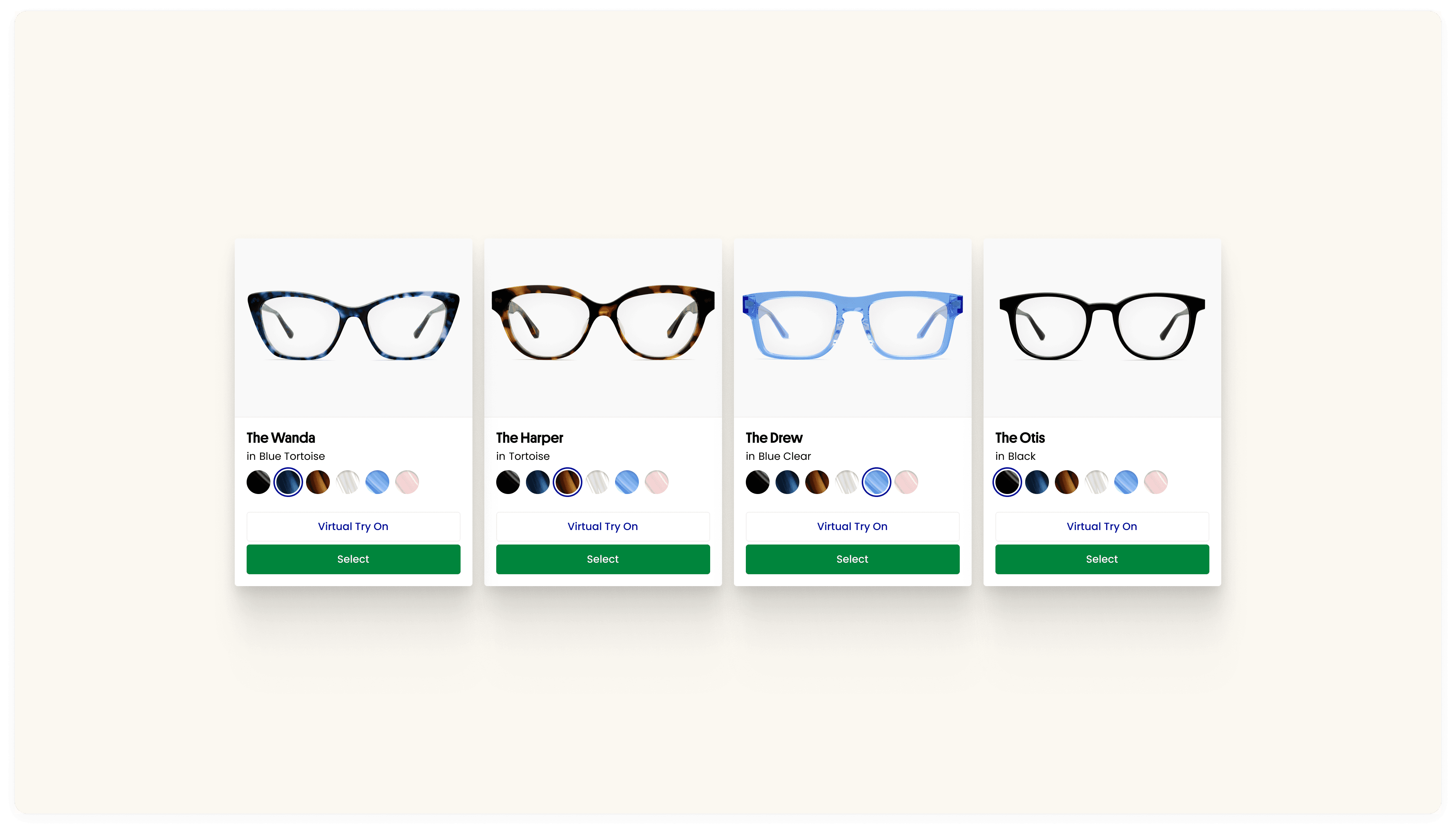
Pair Product Card
A reimagined the product card, merging multiple components into one cohesive and innovative design solution.
What’s the problem with our Product Cards?
Challenge
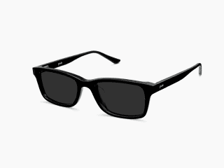
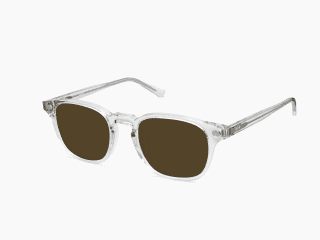
Pair Eyewear's digital product relies on many variations of product cards across different touchpoints. This creates management difficulties due to scattered implementations within the design system and codebase. This redundancy slows down workflows.
Solution
To consolidate all variations into a single, flexible, and scalable component that can be used across the site experience. This future-proof solution will streamlined workflows and ensured easy adaptation for years to come.

Defining Product Cards Variations
In reviewing our product cards, I identified that they were designed independently for various touchpoints across the website. This led to a siloed approach. To address this, I conducted an audit and established a set of five standardized product card styles that would be both user-friendly for design and efficient for engineering to implement.
Product Card Anatomy
To ensure design and development efficiency, I streamlined the product card into two core components: Rich Media and Content. This promotes a flexible layout that effortlessly scales to accommodate diverse content and future needs.

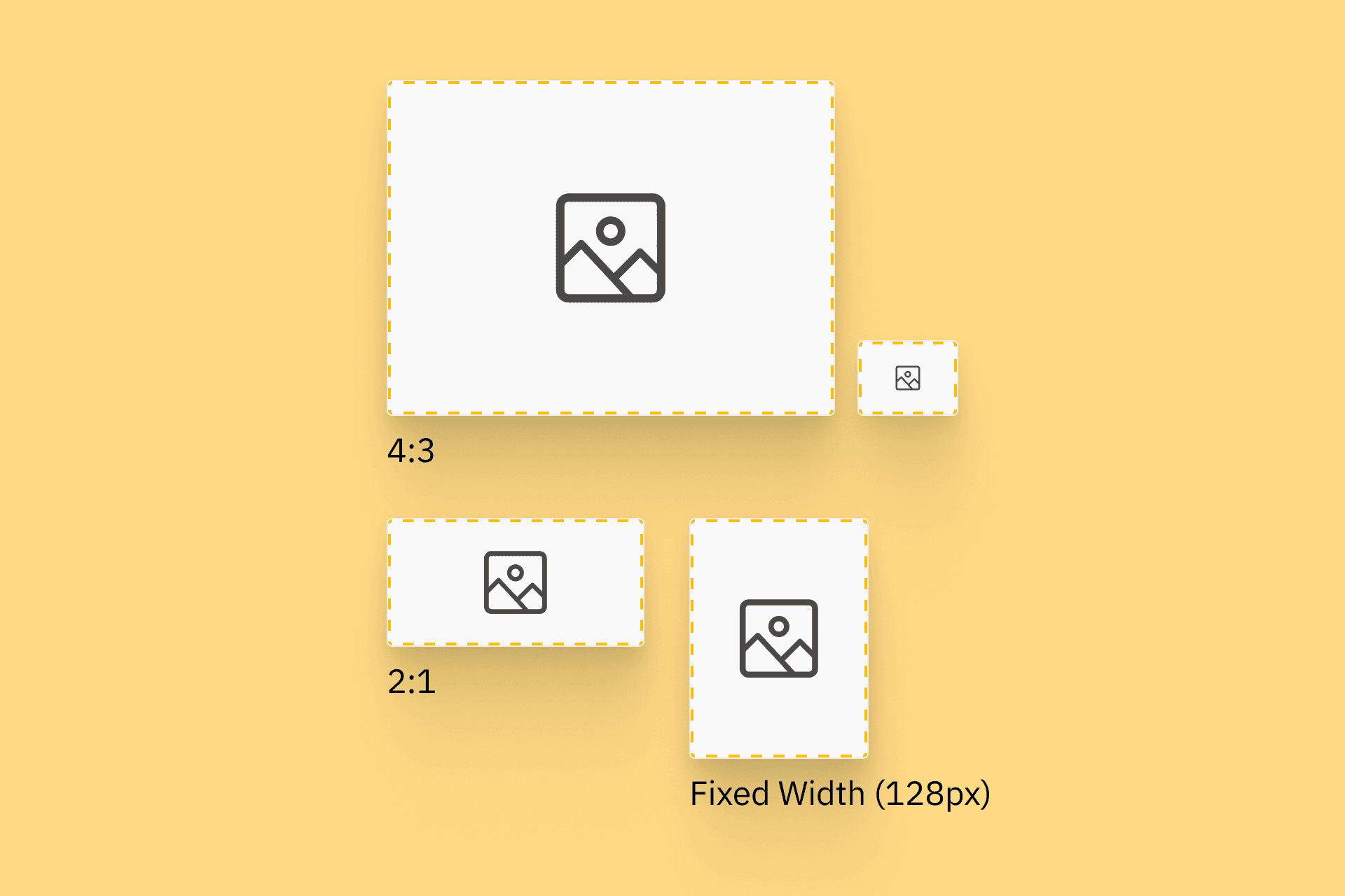
Rich Media
Aspect Ratios
Inconsistent creative asset sizes hampered product card design. We tackled this with standardized aspect ratios: 4:3 for balanced detail, 2:1 for maximizing product grids, and a fixed width with a flexible height. This simplifies design, streamlines asset creation, and ensures a consistent user experience.
Creative Assets
Initially, the product card's Rich Media section was simply called the "Image Area." However, this term limited our creative potential. Our marketing team was producing high-quality product videos, and we envisioned incorporating engaging GIFs to enhance the shopping experience.
Content
The Content section of the Product Card is standardizes the information and actions allowed, all the while being flexible for current and potential future needs
Impact
The implementation of the new product cards yielded significant improvements within a short timeframe. Let's take a look at some key metrics that demonstrate this success:
Improved Developer Velocity…
Incorporating new features into the product card component decreased from an average of 3 dev days of work to 2 dev days
…As well as
Time taken for projects addressing pages featuring product cards decreased from an average of 6 dev days to 3-4
Less Developer-side Iteration
Product Card updates are now quarterly (vs monthly) thanks to a more robust design and wider use case coverage
More ATCs!
Top Frame attachment rates in the purchase funnel soared by 27.7% (from 1.8 to 2.3) in the quarter following the release.

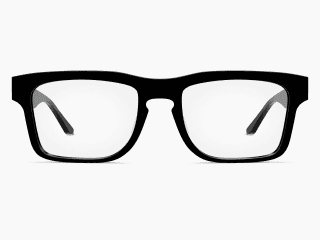


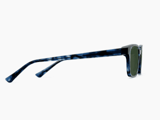
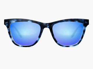
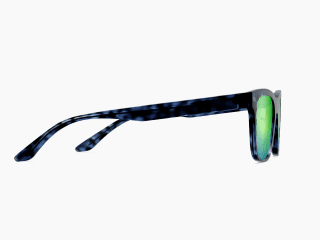


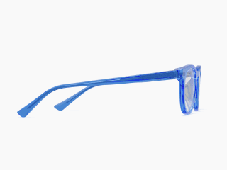
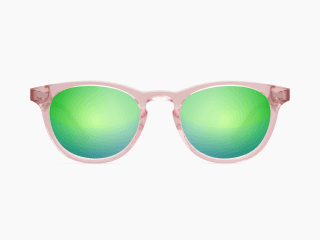
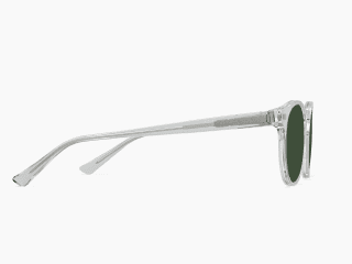
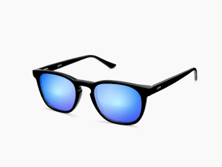

Base Frame Component
At Pair, with 18 unique frame shapes, 6 color options, 3 product angles, and 8 lens colors, managing product card image assets was a challenge. To tackle this complexity and ensure design efficiency, I implemented a system focused on organization. Clear layer naming within Figma makes specific elements easy to find. Optimized layout keeps assets accessible, and standardized component properties streamline updates across all variations. This meticulous approach not only boosts the product design team's productivity but also empowers other stakeholders to leverage the design system for their needs, fostering seamless collaboration.
Prioritizing Scalability
The product card component had the potential to become a tangled mess of variations. To prevent this, I took a strategic approach focused on flexibility and scalability. By carefully planning the structure of the base frame and lenses assets, I ensured it could be used in any combination possible. This not only benefits the product design team by keeping the component easy to use and modify, but also empowers other cross-functional teams who leverage the design system.

Unifying the Product Card Experience
I adopted the system mentioned above into the rest of the product cards with base frames and built adoption with the rest of the design team and cross functional friends to ensure we are all using the same component and standardizing how this asset looks on site.
Take a peek:


Effortless Controls
A well-organized layer, frame, and component structure alongside optimized component properties were key to creating an exceptionally usable base frame component. This focus on both structure and functionality ensures designer efficiency.

Bringing it to Life
This Figma embed showcases the product card seamlessly interacting with the base frame. Explore the design to see how the components work together!
Variables + Grid System
Last year, Figma announced Variables. Some design nerds gasped with excitement and others nervously went back to their comfort zone using styles hoping that no one on their tech team heard the news. I was super excited about the announcement and since then have been gearing up our Pair Design System with variables ready to pivot over. In the process, I strategized with the good people at Figma with a plan on how to incorporate their REST API onto our tech stack and had many awesome conversations with our devs and engineering leads on envisioning a world where we speak in semantics. Gone would be the days where we indicate that this corner radius is 8px, rather we would say /spacing/corner-radius/M.
Oh, one can dream…
One Screen, One Dream
Imagine a world where you only need to design an experience just once. No need for a separate mobile, tablet and desktop screen. Set it up right with variables and you can achieve this!


User Testing "Real" Experiences
Don't you hate it when you are setting up a user test and you need to give really specific tasks? "Now please add exactly 3 green apples to your basket, if not this prototype will break…" I have been guiding my team to use variables when building out their prototypes and now we can say something like, "Go ahead and add any fruit to your basket as you normally would."
Grid system demo:
Grid System
When establishing the foundation for our responsive web design, we carefully considered various grid system options. Ultimately, we opted for a 12-column grid system due to its exceptional flexibility and ability to adapt seamlessly across different screen sizes.
Getting Buy-in
We often grapple with the fundamental question: why is change worth pursuing? The answer lies in its potential to unlock significant benefits for both users and the business. In my experience, crafting a compelling argument for a new or improved design component hinges on a clear understanding of the upfront commitment involved and the long-term value it delivers.
Product Card Pitch Deck:
Pitching a New Approach to Product Cards and Grid Systems
A complete overhaul of product cards and the responsive grid system wasn't a simple sell. I tackled this by creating a clear presentation outlining the limitations of the existing system and the benefits of a unified approach. This deck effectively communicated the project scope and secured buy-in from senior leadership and engineering leads.
The initiative launched in Q3'23, and the impact has been significant. With standardized product cards housed in a single component, engineering velocity has seen a dramatic increase.
Hero Banners Pitch Deck:
Optimizing Hero Banners for Impact
While the engineering team tackled the new product cards and grid system, I identified another opportunity within the digital product: our hero banners. They lacked responsiveness, functionality, and the ability to effectively showcase our products.
Proactively, I created a vision deck outlining these issues and proposed strategic improvements. This approach again secured buy-in from leadership and engineering.
Over the past few quarters, we've been rolling out hero banner improvements that strategically align with product launches, maximizing their impact and storytelling potential.

Take a peek:
Component Properties
Over the recent years, a good product designer is thinking more like an engineer and vice versa. One way we are speaking the same language is by building out components using properties and enabling the manipulation and testing in Figma's Dev Mode. At Pair, my role as a Product Design Leader is to evangelize our design system and encourage apprehensive designers and engineers to think about our design more systematically.